
Many illustrations on this blog and the Blank Canvas Sampler feature the custom Blank Canvas Living font… 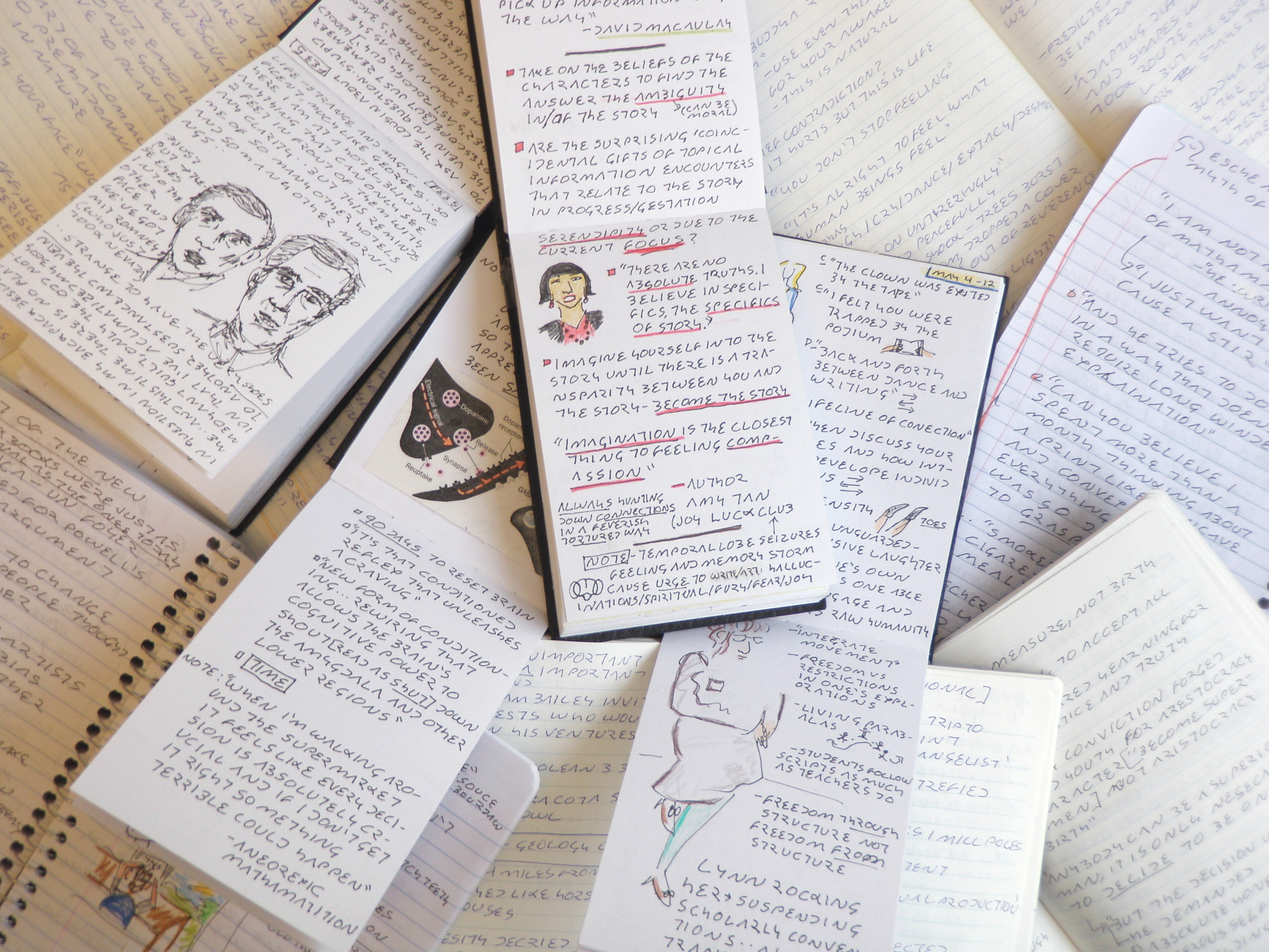 In this age of constant communication, the medium of our translation is homogenized into set typefaces of surprisingly limited variation. We are losing our personal relationship with the physicality of the written word. How can we reconnect?
The English language gives us two options: printing or cursive. But for those of us who live, ski, and make love right on the edge of control, our bodies cannot be counted on to transmit the depths of our emotions using either of these two rigid systems in any legible way. Wrists cramp and tendons tighten in the effort to keep a balance between the flow of our ideas and their subsequent communication. What’s the solution? Designing our own new handwriting fonts!
Since the success of any system depends on its adaptability, accommodation, and regeneration, the primary criteria for any new handwriting font actually gives us plenty of space to play. It must be adapted to our bodies and ideals, accommodate readers accustomed to current systems, and regenerate through ease of transmission through learning.
Using the blank canvas living font as an example, let’s look at a specialized set of secondary criteria. Note: #1 and #2 combat my personal spaz factor, while #3 and #4 honour my individual ideals concerning love, symmetry, and neuroscience. 
1- Limit of one pen stroke per letter
2- Limit of one sharp direction change per letter
3- Each letter must relate to mate (sigh… a hopeless romantic in pursuit of geometric elegance)
4- Must be intuitively legible in relation to previous font systems by triggering appropriate letter-form concepts in our neural network
Whatever you choose as your unique secondary criteria, remember to be as loyal as possible to our pre-wired letter-form concepts (upper and lowercase are part of the same cluster of neural connections and therefor interchangeable) because gestalt can only get you so far. Once you have a working theoretical system (see chart), it’s time to train the ol’ brain by practising until it becomes automatic and intuitive – won’t take as long as you think. When taking any system from theoretical to practical, in any field, modifications will most likely be required with respect to the original criteria. In this case, the yellow chart boxes indicate where certain geometric concessions had to be made (albeit painfully) in order to better accommodate readers.
Is the blank canvas living font a successful system? My hands and wrists don’t ache anymore; my research notes have a unprecedented cleanliness, and my individual passions are expressed every time I put pen to paper. Does it accommodate new readers? You be the judge! Click the top pic to enlarge the image and test it out for yourself. But even if adaptability and accommodation are satisfied, only time will tell whether the BCL handwriting font will regenerate beyond its originator.
IBM took market share in the 1960s because its computers accommodated (integrated with) its previous office offerings. And yes, even I the proud parent, can admit that the blank canvas living font has a few potential weaknesses in terms of accommodation: numbers must be circled for differentiation’s sake, starting a sentence with a 3 can look rather odd, and the X and K can be a bit confusing for first time readers. 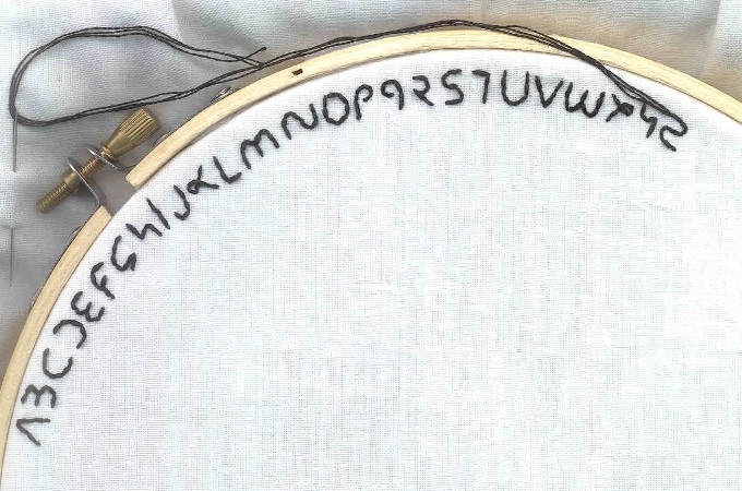 However, I must leave the resolution of these ‘minor’ issues to the next generation of BCL adopters, because every successful system evolves through time. But I will say that eliminating the upper/lowercase complication has proven to be surprisingly liberating and makes potential regeneration through learning a full 50% easier.
Most importantly, what’s made the whole ideation, development, and retraining process worthwhile is that I can finally read my own writing!

This just blew my mind
And you just made my day – It’s surprising what can happen when you add a little romance… to life, to love, to geometry~
Wow this is really cool! I love the reflections…
Thanks Rachael! It was so much fun playing around with flips and twirls. It’s amazing how many aspects of our lives we take for granted as ‘written in stone’, when they have an innate, internal flexibility. As long as communication isn’t hampered, we are free to play at stretching ‘the rules’ far further than we’ve been led to believe.
Pingback: Blank Canvas Sampler: How to incorporate and care for plants in an office environment « Blank Canvas Living